The Future in Focus: American Greetings Young Professionals Resource Network Brand Identity
Brief
Create a cohesive and engaging brand identity for YPRN that reflects the creative and collaborative spirit at the heart of American Greetings. This identity should resonate with young professionals across all departments, capturing their energy, ambition, and desire for meaningful connection. It must strike a balance between professionalism and a modern, vibrant aesthetic, helping YPRN feel both credible and exciting. Ultimately, the brand should inspire participation, build community, and position AGYPN as a vital network for growth, support, and innovation within the company.
Execution
The American Greetings Young Professional Resource Network branding suite is designed to connect with young professionals ages 20–40 by combining modern design trends with a professional edge. Organic, fluid shapes reflect creativity and growth, while a versatile blue color palette conveys trust, stability, and energy. A soft, clean sans-serif typeface balances approachability with professionalism, making the brand feel fresh yet credible. Together, these elements create a cohesive identity that inspires connection, supports career growth, and reflects the innovative spirit of American Greetings
Role
Designer
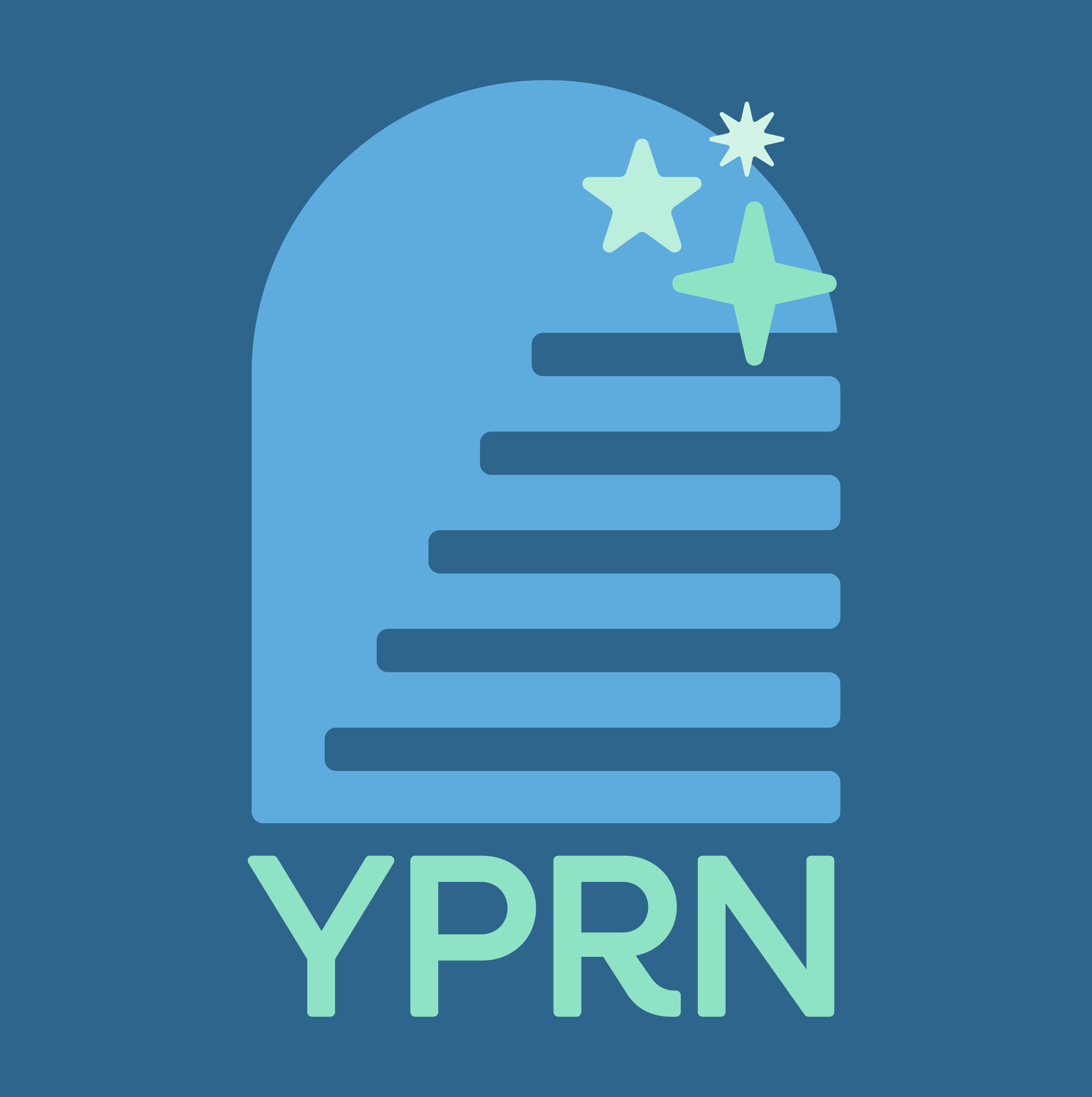

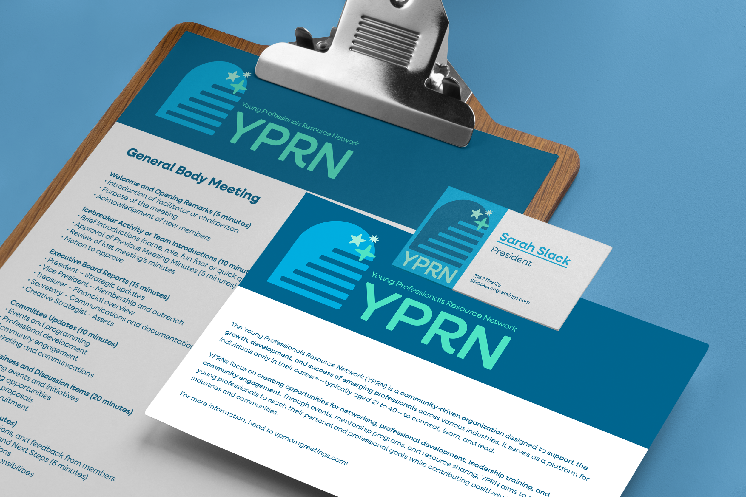
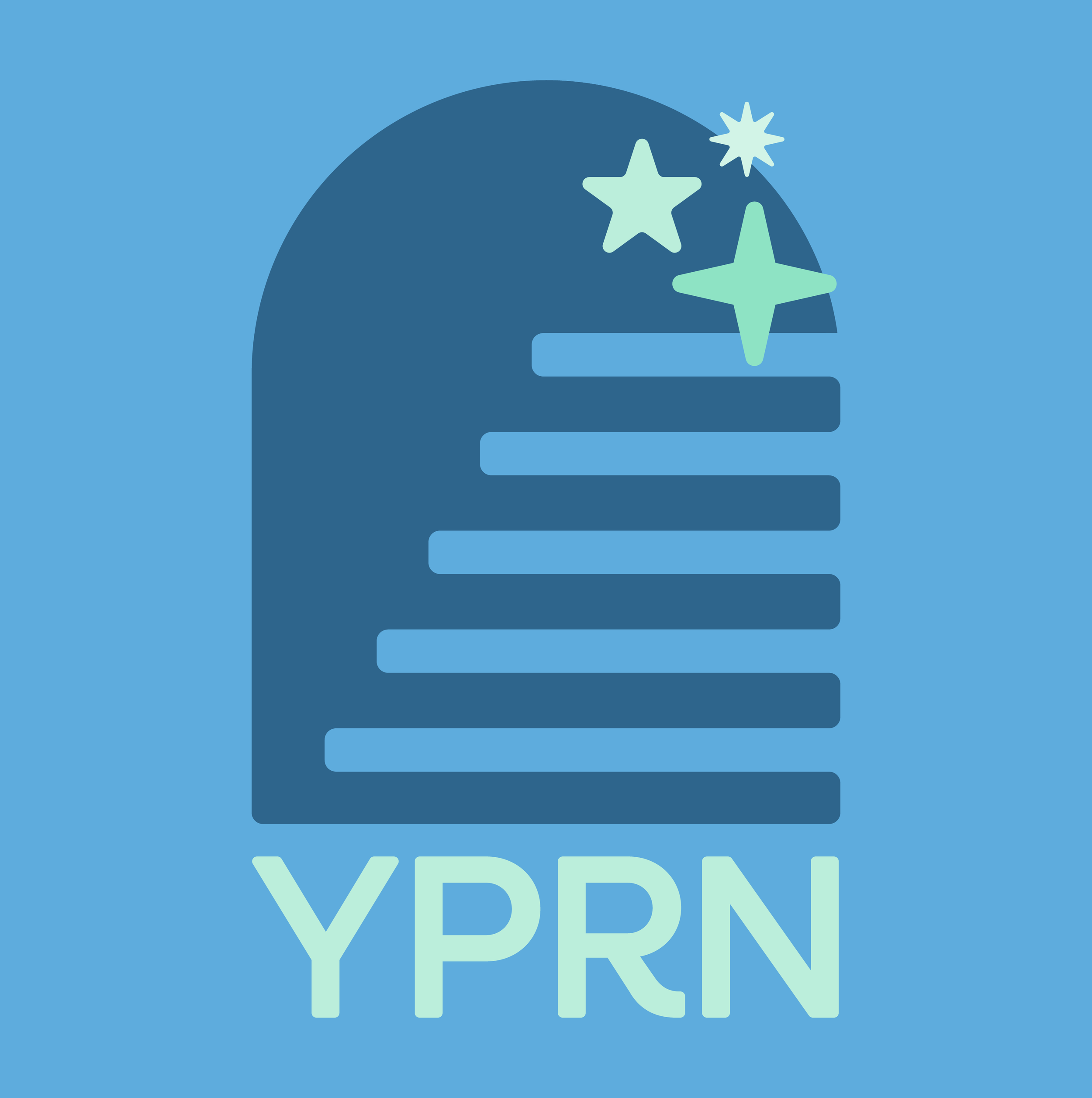
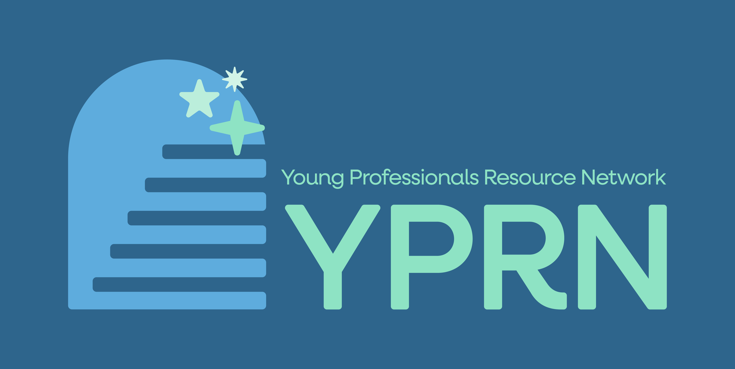
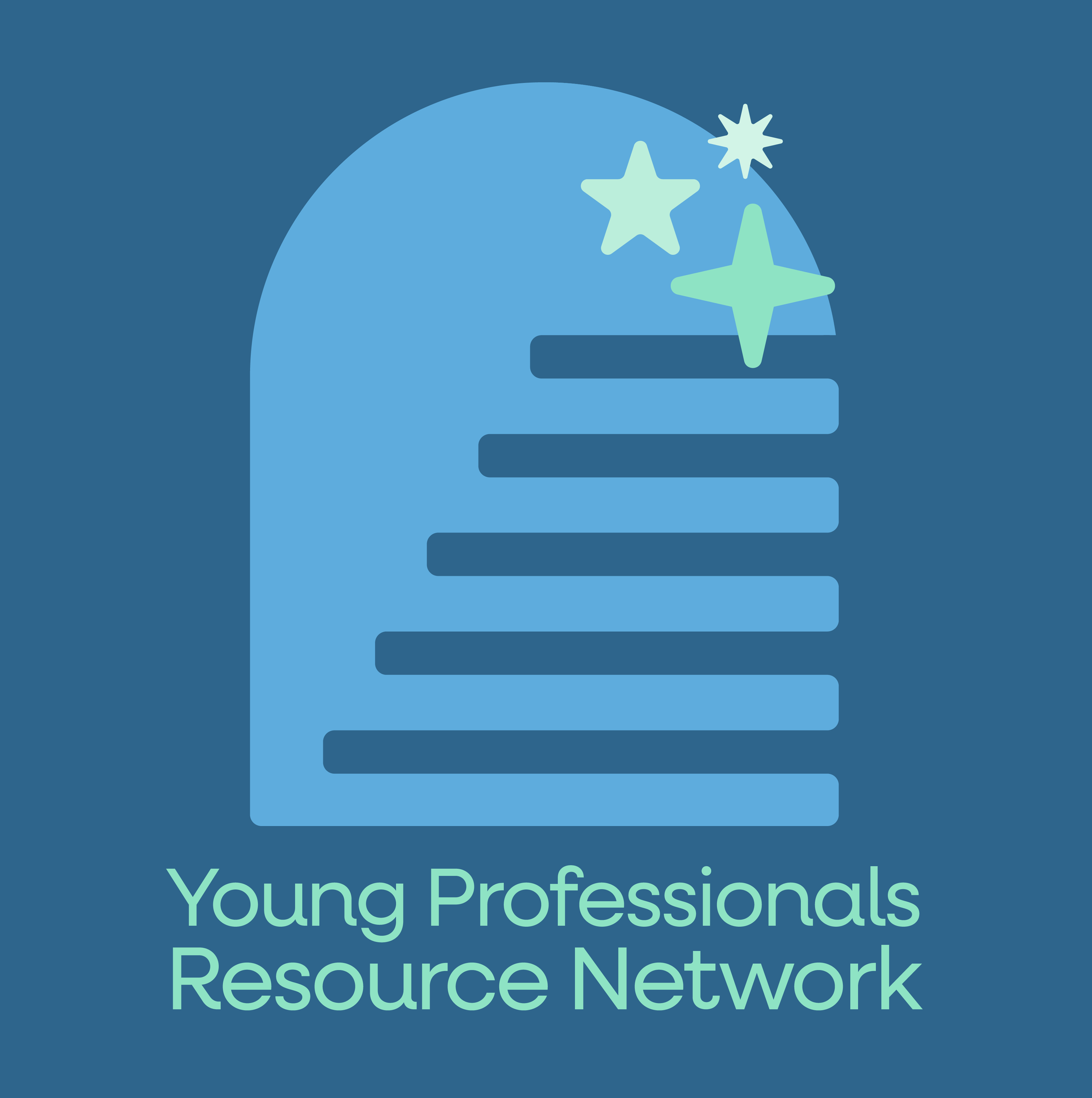
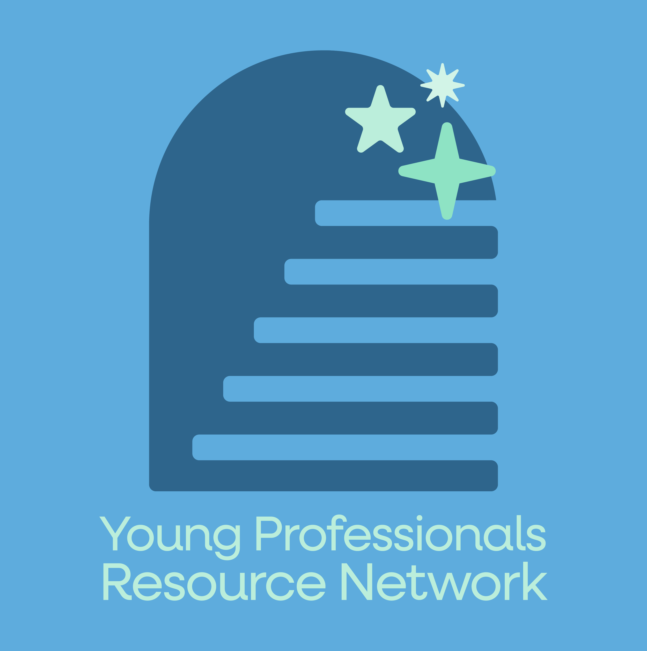
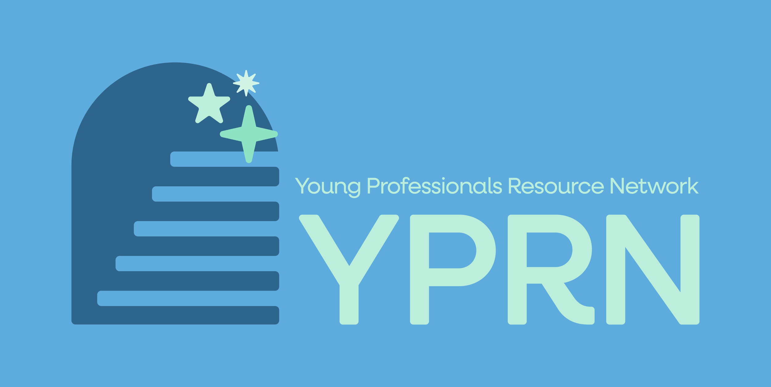
Logo Variation
The new YPRN (Young Professionals Resource Network) logo was designed to reflect the energy, ambition, and evolving needs of today’s emerging workforce. Featuring a stair icon symbolizing career growth and upward momentum, the design is paired with modern, organic shapes to convey adaptability and forward-thinking. The use of varying shades of blue reinforces themes of connectivity, trust, and community. Altogether, the refreshed logo captures YPRN’s mission to support and inspire the next generation of professionals with a clean, contemporary aesthetic that resonates with its growing network.